by Kristin Frauenhoffer
Let´s talk about facts! Facts about the world. Do you know how many percent of the world´s population live in low-income countries? 9, 37 or rather 61 percent? Or do you know how many people worldwide have access to safe drinking water? Around 30, around 50 or around 70 percent? A big survey conducted by the Swedish foundation Gapminder found out, that more than 80 percent of people get the answers wrong. And, at least for the questions mentioned, rather in the negative direction. That means, they see the world in a darker light than it actually is. Some results show the opposite effect – the world is transfiguered. But either way it does not represent the reality. Gapminder wants to fight this „devastating ignorance“ with a fact-based worldview everyone can understand.
What is Gapminder?
The name of the independent Swedish foundation refers to the „gap“ in the knowledge of many people when it comes to estimate global developments. And just like how you should „mind the gap“ between the train and the platform – where the expression derives from – the foundation is committed to recognizing this gap and closing it. By doing so it does not pursue any political or economic agenda neither does it belong to any state institution. It is a donation-funded non-profit organization. „For the first time in human history, reliable statistics exist for nearly all aspects of global development.“ says the website. It should be used. So Gapminder´s work is to first identify systematic misconceptions about important global trends and proportions. And then use reliable data to develop easy to understand teaching materials to rid people of these misconceptions.
Where do the misconceptions come from?
It is not dificult to identify where the misconceptions come from. In the media we see extraordinary, dramatic events every day. Be it earthquakes, diseases, murder, floods – the world seems like a terrible place to us when we read the newspaper. It is the desire of the journalists to grap and keep our attention. Because sensationalism is a deeply human emotion. „If they would focus on slow global trends and proportions, most of us would likely skip through those articles, hunting for a more interesting read.“, says the Gapminder webpage. I guess most of us can relate to that. So how can we start correcting our worldview from an emotional to a rather fact-based one?
Worldview Upgrader helps to identify misconceptions
One tool Gapminder uses is the above mentioned „Worldview Upgrader“ which is freely accessible on their webpage. In a kind of quiz, you can test your own world view and compare it with that of the survey participants. The basis for the questions are the UN’s Sustainable Development Goals (SDGs). The surprising thing about it: all the questions are answered wrongly by the majority of the respondents. Every questions is explained in detail and all the qources are shown, which make the tool a real eye opener.
Dollar Street shows: other people are less strange then we think
The second tool accessible on the webpage is a project called „Dollar Street“. It adresses another form of the metioned „devastating ignorance“ – that of the starving african child. Initially this image is supposed to evoke compassion in people from the so called „civilized world“ so that they donate money. It is supposed to bring people together, but in fact it does the opposite. It draws a line between „them“ and „us“.
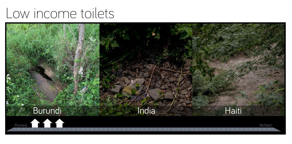
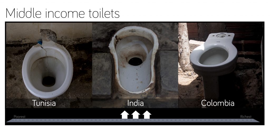
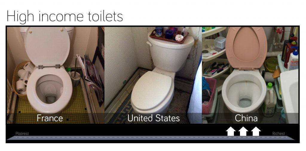
Dollar Street is a photo project that shows the homes of people in 50 different country, from the toothbrush, to the best shoes, the kitchen equipment, toilets or beds of the residents. “If you search for “sofa” on Google, you will find the fancy sofas affordable only to the richest percents of the world population. On Dollar Street you find the real sofas. On all income levels.”, says Anna Rosling Rönnlund about the project she launched. Because the special thing about it: The houses are placed on an imaginary street, ordered by the monthly income of the residents. Left you find the poorest, right the richest.
So you can see in an impressive way how things of daily use reflect our standard of living. Comparing low income, middle income and high income toilets affects the viewer in a more realistic and direct way than the image of an African child. And it definitely helps you to get rid of one or the other stereotype.
The story of Gapminder starts in the 90s
For example the stereotype that the world is divided in „civilized“ and „uncivilized“ people. Even though no one would claim to have such a worldview nowadays, this „colonial“ mindset can still be found. For example, by praising the supposedly „natural“ way of life of poor people. This worldview is the beginning of the story of Gapminder. It starts in the 90s when Hans Rosling, a Swedish doctor, came back from Africa, where he worked for some time. He started teaching at the University of Uppsala and was shocked about how his students thought about the african continent. So he set to correct this image the best he could.
There is no „first“ or „second“ world
He began with a simple graph showing the relationship between income per capita and people’s life expectancy. Following the postcolonial view of a „first“ and a „second“ world, Europe and Noth America would be in one corner of the graph and the other countries in the other corner. But the reality shows: Most of the countries on all the continents are to be found in the middle somewhere. The message that Hans Rosling wanted to convey was this: The world is a place where people are not either rich or poor, but somewhere in between. Not black or white, but grey.
An animated infographic that changes the world(view)
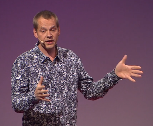
Ola Rosling, Hans Rosling´s son further developed this graph after founding the Gapminder foundation together with his father and wife Anna Rosling Rönnlund. He put another dimension to the graph – the time. All the countries became coloured bubbles, ordered by continents. In that way he designed an animated infographic where one could follow the development of the different countries over time. And this infographic clearly showed: without exception, all of the countries worldwide moved from bottom left to top right between 1900 and 2000 on the graph. That means even the poorest of them – the „uncivilized“ – have no desire to continue living their „natural“ way of life in the jungle. This visualisation of facts became the basis for numerous speeches and TED talks given by Hans Rosling and his son. Today the infographic-software, that they called „Trendalyzer“ is used by Google.
Gapminder is free to use for everyone
But that does not mean that Gapminder sold itself to the big US company. On the contrary: after the Google deal in 2010 Ola Rosling returned to Sweden in order to advance the mission of Gapminder. Providing people with facts and statistics free of charge. Ola and his wife Anna started developing free teaching materials and conducted the mentioned survey in order to prioritize. Today the Gapminder website is full of free tools and materials to use for everyone – starting with the bubble charts, over videos up to the photos on „Dollar Street“. Everything you can find there is provided with the respective sources. And the „Worldview Upgrader“ even comes with explanations of each question.
So if you are still wondering about the entry questions, I don’t want to keep you in suspense any longer: Only 9 percent of the world´s population live in low-income countries. And the percentage of people having access to safe drinking water is as high as 70! Would you have guessed?
This article is protected by copyright.
More about fighting ignorance:


Deine Daten werden verschlüsselt übertragen. Deine IP-Adresse wird nicht erhoben.
Infos zum Datenschutz